July 29, 2008

Menus and Programs and Napkins—Oh My!

bookmark
It's been really busy this past week at the press—hence the light postings.
Please enjoy the booksmarks above—I've been working on some fun pieces for parties and wedding receptions and will bring my camera in for some pictures soon! 

July 24, 2008

Vintage Stamps

circusstamp

I love finding Vintage stamps. If  they're not already cancelled, you can still send them through (but you just need to have their value add up to whatever the current postal rate is).
Here's a creepy clown that I'm sure scared kids everywhere when they received their birthday wishes. 

July 23, 2008

Remember the Wall o' Paper?

Photobucket
Here it is—the big reveal.
This is a boxed-set of cards illustrated by the über-talented Karima. They are available in a very limited edition, and they are fabulous. 

July 22, 2008

Work-In-Progress

cassandchris

My intention when I started this blog was to show some works-in-progress. I seem to forget this step and tend to give the tv-cooking-show-view of "tada—all done!". So, here is a fine example of a halfway-bound Guest Book that I'm creating for the sweetest couple who will be getting married next month. I've also included a piece from their invitation suite in the photo (the reply card with the peach—yes—it will be a fabulous Southern wedding in Georgia), and will be sure to post the final piece when I'm finished!

July 21, 2008

Wood Type Heaven

wood type 
Okay, I should be standing at my press right now, and not in front of my computer, but (ironically) I have just stumbled into Wood Type Heaven.
I just got off the phone with a very kind man who has over 370 sets of wood type for sale. Pre-Civil War to the Twentieth Century. Sigh. I was so impressed with not only his collection, but the attention in which he lovingly cared for these pieces. He said that some were so dirty when he bought them that he didn't even know what he had. He cleaned them and polished them (with felt, no doubt) and loved them. He has been archiving them for the past year and it's just so interesting to me to have stumbled into his world.

While of course I'd love to be considered in receiving/buying such a collection, I know he will find exactly the right home for these amazing pieces of history and art. 

Cooper Black

cooper black
My friend Hannah sent this picture over to me. It's another fine example of a business who went the distance, and incorporated the font into their business name (in this case, "Cooper Tires" is using the fine Cooper Black as their font). I can't get enough of this and thanks, Hannah (ps. please start blogging again because I love yours), for adding this to my collection!

July 18, 2008

The Printer's Devil

little devil
Printer's Devil  n:  an apprentice in a printing establishment.

When I learned to print, it was with lead type and everything was hand-set. It was here, at Peter's shop that I learned the term, "Printer's Devil". The Printer's Devil could be counted on to do such mundane tasks as distributing (sorting and putting away—letter-by-letter) 6 pt. (tiny) type, cutting paper and keeping the shop clean. In the earlier traditions of printing, one didn't get a computer, buy a press and set up shop. It was a many-years-learned process in the true craft tradition. 

So much for keeping my family out of my work. Above is a picture of my little Printer's Devil at her happiest. No need to call OSHA—she's not handling any lead type (yet) but she does come to the shop with me. I'm a working Mom and I'm really grateful for the fact that I can take park breaks with my kid.

July 17, 2008

It used to be called "Fake Wood".

fake wood

A few years ago I did a poster for Maybelle at Stumasa. It was to commemorate the store's then 2 year anniversary, and it was really fun. Being that they sell hand-made furniture (amongst other things), I thought it was only appropriate that the poster reflected this fact. Here's an image of how I did it: I took a large sheet of linoleum, some carving tools along with half a glass of wine and ta-da—instant faux bois! Shown here in black ink (though the poster was done in a light "pine" color), I am about to resurrect this tired old linoleum and bring it into some new pieces. Stay tuned.

July 16, 2008

New Work


new_work2  
full piece (with brown kraft envelope)

This is the latest piece from a new collection that I'm working on.
Inspired by orange-crate art, I thought it was perfectly appropriate for this sweet couple's country-themed wedding.

I love it. It is comprised of 3 colors (the outline of the berry is a deep plum) and is now available to all. Please pass this along to anyone you think might be interested!

July 15, 2008

Here Comes the Bride


This is a vintage pattern that I've come across via the webs. I've done some cards inspired by patterns and I thought this was a good sampling of some of the patterns I'm drawn to; I love the simple design of this—the white dress on yellow paper, the blue dress in the back, and the Rosewood (fill) font used for Butterick.

July 14, 2008

Happy Bastille Day!

eiffel

This is an image from a crazy cut that I have. It's a triptych that features the eiffel tower (above), a man at a beach and the strangest one—a vacuum cleaner and various electrical home appliances. Qu'est-ce que c'est? Probably done in the '50s, I really love the way they created the clouds. 


July 11, 2008

Signs

park avenue

One of my favorite things to find as I'm out and about is the sometimes clever use of fonts in a sign. Not only is "Park Avenue" the name of this restaurant, but it's also the name of the font that they used. Brilliant. 


July 10, 2008

Keeping It Real

wallopaper 
Little wall o 'paper saying, "Print me, now!"

So, I'm barely in to this blog and it's already here—the reality of my work has set in.

I am both a designer and a printer; some simply do one or the other, but I for various reasons, like to do both. I know—most accountants would accuse me of not being so efficient— but that's why I create and they don't. The phases of my work-life goes something like this:

I meet with people and we discuss what they are interested in having me create for them. We first talk about their inspirations for said-pieces (be it invitations, coasters or other printed delights) and I get a little history about their details, likes, dislikes, etc. Sometimes this happens over the phone or at my studio, but since most of my clients live all over the place, it mostly happens over email. Once I get a feel for what my client is trying to convey, I start to get some visuals and then I go to work. I really enjoy this process and it's fun to take someone else's words and make them into pictures. Once I have all of the variables together and I've created a mock-up (sometimes a few), we finalize all of the final details. And then I really go to work.

This is the point where many designers send everything off to the printer and move on to the next project. In my case, I do the same thing, but the printer is me. I do send the files off to my friend Richard to have the film made, and once I get this, I can make the necessary plates, cut the paper and do the actual printing. Each piece is hand-cranked through one of my old presses. Again, nothing is fed automatically (insert said-accountant's sighs and eye-rolls here) so this is a very hands-on process. I really do love this  and for me it's really, really satisfying to see the fruits of our (me and my client's minds) labor show up in my hands. 

But the point of this post is to say that I am in absolute crunch time with a BIGFANCYPROJECT and I am about to go to press with it, so I don't have time to keep up the blog today. 

Pictures to come soon!

July 9, 2008

V is for Victory

victory stables

Like many graphic designers, I'm a freak for hand-painted signs. This one, located in sunny downtown Oakland, truly delivers.  I've always wanted to create a line of cards based on the alphabet and you can bet this is the inspiration for the letter "V". If anyone knows anything about the creator of this sign, please drop me a line!

July 8, 2008

The Little Things


c&j1  color one
c&j2  color two

{Okay, bear with me as I try and figure out this uploading/photo editing feature, but I think you get the gist here.}

These are details from a suite that I've just printed for a lovely couple who are also complete animal lovers. 
The top picture is of the first color. If you look closely, you can see the little knocked-out "C" on the dog on the left. With the addition of the second (green) color (and plate)— voila'— instant cute. Yes, it may have been easier to just print the green on top of the dog, but I wanted it to be perfect (so I knocked out the letter on the dog layer). 

It's all in the details.


July 7, 2008

Friends Far and Close

margaret

This is a small painting done by Margaret Kilgallen. It's of a bookbinder and I love the way she drew all of the tools on her workbench.

I had the pleasure of working with her and my friend, Dan Flanagan, years ago at the San Francisco Public Library. It seems like a really long time ago, and worlds-away for so many reasons, but I really cherish those memories. We could all just sit and talk/argue about bookbindings, letter-forms and life in general, drawing on the daily inspiration sitting in each of our hands. In our jobs, we all had a common goal (mending and preserving books) yet we all approached this with such different styles. 
I had studied bookbinding first, prior to letterpress printing. My hands/brain understood how to build a book but it was getting the printed-words on to the pages that now piqued my interests. Margaret and Dan had both been accomplished printers prior to being bookbinders, so we were all somehow in the same collective mix. It was at this time that I finally had someone to try and identify typefaces with or guess the period of a book based on design-decisions, binding-styles, etc. (and no cheating/without just looking at the publishing dates). I loved it.

Like many people, we all crossed paths and became friends through/because of our jobs and frankly this was my favorite part of working at SFPL. 

I'm not sure where I'm going with this; I guess I just miss my friends today.

July 3, 2008

Blame The Printer

Dunlap Broadside

According to Wikipedia:

In the United States, Independence Day, commonly known as the Fourth of July, is a federal holiday commemorating the adoption of the Declaration of Independence on July 4, 1776, declaring independence from the Kingdom of Great Britain. Congress approved the wording of the Declaration on July 4 and then sent it to the printer. Whether John Hancock, or anyone else signed the document that day is unknown, because that document has been lost—presumably destroyed in the printing process. Hancock's name and that of a witness do appear on the typeset broadside that was published within a few days.

The Dunlap broadsides were the first published copies of the United States Declaration of Independence, by John Dunlap of Philadelphia. On August 2 in the following month, an engrossed document in script form was signed by Hancock and other delegates.

{image above of Dunlap's broadside is from Wikipedia}


Happy Independence Day.

Wood Type

woodtype

I have a small collection of wood type that I absolutely adore. With the popularity of Ebay, it has become more difficult and very expensive to find. In addition to this are the folks whom I really get upset with who will sell a single letter or—the even more (I'm sorry) offending—wood-type collage.

Here is a small broadside that I printed after Astrid (my baby) was born. With all of the above being said, I don't always have a full alphabet to work from, and it's fun to make it work with what I do have. Setting type while standing at the press is a rare luxury for me these days and I like the creative aspect of it. Sounds strange but sometimes working on a computer (with its endless possibilities) can be a little daunting and I still like to see what comes from my hands.

July 2, 2008

Custom Event Group

Photobucket

Congratulations to Rebecca Feeney of Custom Event Group! She is one of the featured Event Planners in the latest issue of The Bride and Bloom. Rebecca and I have worked together on a few projects now, and I can't rave enough about how talented she is. Plus she's incredibly nice.
Her Fall-inspired table is a rich palette of aubergine, gold and green. Not the obvious pumpkin-orange and I think this is a great example of her unique eye. I'm proud to have a table card featured along with such a talented group of vendors. 

July 1, 2008

Ink, Ink and more Ink

Photobucket

One area that I think my clients are surprised to learn about, is the inking process. With letterpress printing, we call it, "spot" color. That means that each color requires a separate plate and press run (and its own color of ink). 

In my case, color is one of my favorite parts of printing. Adding a dash of black to pink makes me really a little too happy. Call it a control-thing, but I love love to hand-mix my ink. Yes, many printers do/can buy a can of already-mixed ink, but that takes out all of the fun for me. 

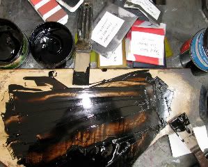
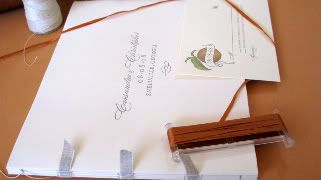
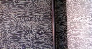
Here's a picture of what this process looks like. I use fancy putty knifes and scoop out the allotted-dose of each color and mix them on a smooth surface. In this case, I'm using small parts of black with brown on my litho. stone. There is a 'pantone book' (much like paint swatches, but much pricier) which I can follow if I am to match a pms color, but many times I go by my eye. This ability is very very useful when matching swatches of fabric, or using transparent ink for a slightly washed effect. Plus I've found that sometimes using just the book would deprive me of some pretty amazing colors.

After I've achieved the perfect color (and if this is to be an ongoing-project), I will save the ink in little packets and mark the client's name and date on them, so I can reuse them the next time we go to press. 

On the stone right now, it looks a little messy, but I've just achieved the perfect coffee brown for a small project I'm about to do for Peet's Coffee & Tea.