May 6, 2015
Oakland Mini-Moon on Snippet & Ink
Hi all!
I am thrilled to share with you my very first guest-post that I wrote for the fabulous Snippet & Ink! Up on their webiste today, it is a celebration of all of my favorite things to do and see in Oakland. Click here to read all about it! xo Victoria
greetings, letterpress printing
Milkfed Press,
oakland,
restaurants,
shopping,
Snippet and Ink,
vintage signs
March 7, 2015
The Milkfed Press Monthly — Issue #01
It's been forever, and I must say, this will probably be my last post here.
If you're subscribing, I invite you join me in a new subscription-based "inbox-zine" via my website. It's a free, strictly-for-fun endeavor and should come to you in an easy manner.
Once you sign-up, you'll be able to keep up with me in and out of the studio. The first issue packs a punch, and while I just now sent it out into the world, I'm already working on issue #2.
Sign-up for it right here: website
Thank you for your interest and support!
xoxo
greetings, letterpress printing
Letterpress printing,
Milkfed Press,
talk,
typography,
zine
November 11, 2014
2002 rang...
... and I took the call! After years of being asked, I did it: I set up that Etsy shop, and you can go to it by clicking right here. Just in time for the holidays! I hope to be adding to this somewhat regularly, so please check back when you think about it.
xo Victoria
greetings, letterpress printing
etsy,
greeting cards,
letterpress,
Milkfed Press,
shop
October 31, 2014
Reinventing The Wheel
Hi All!
I thought I'd take a break and share some of what I've been up to. Well over a year ago, I mentioned here (click) wanting to slow down and take some time to get back to the process of printing. In truth, I was seeking the time to go back to the simple process of being a beginner. To try something new, and to be okay with whatever the outcome. I spent my spare time with some beloved wood type, some paper, and the press. No computer and no deadlines—you get the idea. In the last year, my new medium of choice has been sign painting. I am very familiar with lettering and typography, but the craft of sign painting adds a whole new dimension to this. In short, it is a humbling, delightful experience for me. It has sharpened my designer-eye and given me an entirely new appreciation for letterforms. The above picture is an example of the before and after. I was able to take my hand-painted-version, and translate it into a plate for letterpress. I really like the casual brush letters when they're pressed into the paper.
While I'm hardly ready to hang up my sign-painting shingle, I feel like I have turned a corner in my lettering practice.

Here is another example of some casual lettering and script that I tried. I have had that cut of The Fonz for years, and well, apparently if you build it, they WILL come! I was thrilled to be able to create a piece for Henry Winkler last Spring. He was reading from his new book at Rakestraw Books, (click) and I knew exactly what piece of art I would use!
Here's a snap from my sketchbook. A perfect mantra for my new year as a beginner. Kindness with myself, kindness with others. When I used to teach bookbinding, I would tell my students, "Be nice to yourselves—your head will learn this much faster than your hands will." I have to tell myself this daily.
Here it is in the letterpress-realm. I love the red ink!

Since I'm getting so cozy with this new beginner-state, I thought I'd try something else, as well. It's been years since I did any painting with acrylics, but in the last few months, that has changed. In the image above, I was able to take a few small paintings that I did, and translate them into the letterpress realm. I added some simple hand-lettering, and I really like the outcome. Its fresh new take on a wedding invitation makes me really happy. For more of what I've been up to, please have a look at my website here (click). I've been updating pictures and hope you like it! xo Victoria
greetings, letterpress printing
acrylic paints,
graphic design,
invitations,
lettering,
letterpress,
Milkfed Press,
painting,
Sign Painting,
sketchbook,
typography
August 30, 2014
Happy International Bacon Day!

I love it when my sentiments become a holiday! Printed sometime a few years ago, these are still available in my big cartel shop. Click here. xo
greetings, letterpress printing
bacon,
cheeky,
design,
graphic,
illustration,
internationalbaconday,
letterpress,
milkfedpress,
retailempire
August 12, 2014
Since I'm On A Roll...
Clearly, I'm a worry-er. Previous to our current drought-state here in California, I had my head up in the fact that all of our bees are dying off. This is a big problem.
Taking matters into our own hands, and because we can, cartoonist and sign painter Justin Green and I collaborated on this awesome, three-color print. Taking the painstaking illustrations of Justin, I letterpress printed them in an edition of 100. Each one is signed by Justin, and we have been giving these to the powers that be (no pun). I have a few left over and have put them in my kiosk (click here) for sale.
Meanwhile, here's a quick reference for what we can do to help (this is my summarization of a list written by Philip Chandler):
• Stop using insecticides in your gardens.
• Try to avoid seeds coated with systemic insecticides.
• Read the labels on garden compost—some contain Imidacloprid.
• Create natural habitat (EASY!).
• Plant bee-friendly flowers and plants (EASY!).
• Provide a site for beehives.
• Make a wild bee house.
• Support your local beekeepers (EASY!).
• Learn about bees—tell others.
Thanks for your concern! xo
greetings, letterpress printing
cartoonist,
illustration,
justin green,
letterpress,
Milkfed Press,
pen and ink,
please help,
save the bees,
sign painter
August 8, 2014
Nobody Likes the Potty Talk
Hi All,
Not my typical post, but I am super serious about the drought we are experiencing here in California. As a native, I remember the last serious one in 1970's. Being that we provide food—not just to our state—but to the entire country, as well as other parts of the world, I think we could all be doing our part to conserve water.
Did you know that the average toilet (made in the last 20 years) takes about 2 gallons of water to flush? Older ones can take up to 5 gallons. We have a small family, but multiply those gallons by however many people, multiplied by however many times a day, and you get the picture.
Ideally, this will be a temporary problem—the rain will return and this Fall will bring a lot of water. Ideally. In the meantime, I'm putting my money where my mouth is. I have created these small prints as kindly reminders to family members, and to let guests know you're okay with them not flushing, if it helps to conserve some water. Send an email with your mailing address to me at victoria(at)milkfedpress(dot)com, and I will send this to you (free for California residents, while supplies last). And it's true—nobody likes the potty talk.
greetings, letterpress printing
California,
conserve,
drought,
letterpress,
we can do it,
wood type
July 31, 2014
What's In A Name?
Hello, Hello!
It's been a great Summer—super busy with projects in June and then my family and I took the month of July off for a long-needed family trip! So many pictures to come.
In the meantime, a thought I had about names came up more than once. My daughter's name is "Astrid", and as you can imagine, she doesn't find too many others here in the States. With every museum we went to, there was the inevitable trip to the museum gift shop. There she would search through the mugs, keychains, placemats and other unrelated tschotchkes for the item with her name printed on it. She came close with an "A.J." (her initials), and for now, this will have to do.
But it's had me thinking to a conversation I had with a friend, where I boldly proclaimed that people innately love to see their own name in print. She is a calligrapher, and I was suggesting that she at least offer an alphabet sampler to show her clients, so they could find their letters and see how it looks. Am I off mark here? Do you like to see your name in print? Please feel free to leave a comment—those with the most complicated first names will receive a bonus treat! xo Victoria
greetings, letterpress printing
Milkfed Press,
names,
personalized,
print,
talk,
tchotchkes
March 17, 2014
Kiss Me I'm Irish
Ahhh... St. Patrick's Day is upon us. A day where everyone is Irish, the elusive shamrock is everywhere, and the Guinness flows like wine. Like our beloved St. Valentine, the real St. Patrick spent many years in captivity and survived awful conditions. The lore that follows is an amusing leap and here we are. All kissing aside, it has me thinking of bookbindings, and celtic type.
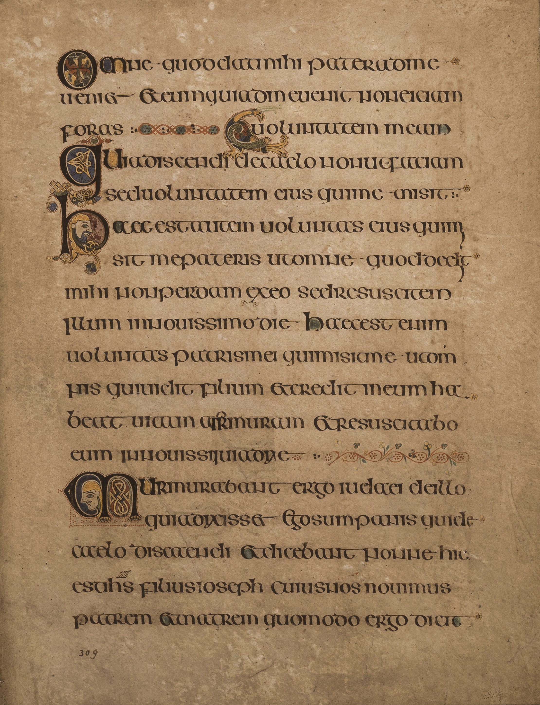
Here is a page from the very famous Book of Kells:

The Book of Kells is a group of illuminated manuscripts. Created by Celtic Monks in (a very debatable) 800 AD., it is a true masterpiece and is considered the pinnacle of Insular Style.
The manuscript was hand-written primarily in an insular script, which greatly influenced modern Gaelic scripts and typography. It has been noted that since the scribes were writing primarily from memory, there are a few instances between the text and the accepted Gospels. Aesthetics definitely took priority over utility or fact.
Here is a close-up of a decorated initial:

To say this is a lavish work of art is an understatement. If you ever find yourself in Dublin, please make way to Trinity College to see this amazing feat for your own eyes. There is so much information about it on the web, as well. It's worth a few hours if you have the slightest interest in art, history, and design. Erin Go Bragh!
Here is a page from the very famous Book of Kells:
The Book of Kells is a group of illuminated manuscripts. Created by Celtic Monks in (a very debatable) 800 AD., it is a true masterpiece and is considered the pinnacle of Insular Style.
The manuscript was hand-written primarily in an insular script, which greatly influenced modern Gaelic scripts and typography. It has been noted that since the scribes were writing primarily from memory, there are a few instances between the text and the accepted Gospels. Aesthetics definitely took priority over utility or fact.
Here is a close-up of a decorated initial:
To say this is a lavish work of art is an understatement. If you ever find yourself in Dublin, please make way to Trinity College to see this amazing feat for your own eyes. There is so much information about it on the web, as well. It's worth a few hours if you have the slightest interest in art, history, and design. Erin Go Bragh!
greetings, letterpress printing
book of kells,
bookbinding,
illuminated manuscripts,
st. patrick's day,
talk
December 5, 2013
Baby It's Cold...
I know "weather talk" is about as boring as it gets, but for us Cream Puffs in the Bay Area, it is COLD out this morning! But alas, it's the perfect segue to talk about an upcoming Art Show that is happening next Friday:
As an irregular writer, if you have found me here chances are you've found me on Instagram (click). This is definitely my favorite outlet for social networking—it's a platform for people to take and share pictures of things that interest them, work they're doing, or really—just about anything. You can follow people (much like twitter) and with time, one might gather a group of really inspiring strangers.
Such is the case with fellow letterpress printer and sign painter Colt Bowden (click). I have been admiring his Colstagram for awhile, and have been wanting to purchase his 'zine, "How to Paint Signs and Influence People" (click). I first learned about him and his work through a fellow student at a sign painting class I took this Fall at New Bohemia Signs. Find him, follow him, adore him. He seems like such a nice guy.
Also curated by sign painter Ken Davis (click)—he is clearly a very talented guy to boot. I met Ken briefly at pal Nat's Bloom Screen Printing Shop, and I have been a fan ever since.
Lastly, The Pre-Vinylite Society (click) is a feast for the eyes and a great way to soothe your over-computed soul.
See you at the show! xo Victoria
As an irregular writer, if you have found me here chances are you've found me on Instagram (click). This is definitely my favorite outlet for social networking—it's a platform for people to take and share pictures of things that interest them, work they're doing, or really—just about anything. You can follow people (much like twitter) and with time, one might gather a group of really inspiring strangers.
Such is the case with fellow letterpress printer and sign painter Colt Bowden (click). I have been admiring his Colstagram for awhile, and have been wanting to purchase his 'zine, "How to Paint Signs and Influence People" (click). I first learned about him and his work through a fellow student at a sign painting class I took this Fall at New Bohemia Signs. Find him, follow him, adore him. He seems like such a nice guy.
Also curated by sign painter Ken Davis (click)—he is clearly a very talented guy to boot. I met Ken briefly at pal Nat's Bloom Screen Printing Shop, and I have been a fan ever since.
Lastly, The Pre-Vinylite Society (click) is a feast for the eyes and a great way to soothe your over-computed soul.
See you at the show! xo Victoria
greetings, letterpress printing
#icycaps,
Bloom Screen Printing,
colt bowden,
design,
icy caps,
ken davis,
letterpress,
Pre-Vinylite Society,
Sign Painting
December 2, 2013
Season's Greens
Like many of you, I cannot believe that December is here already. But alas, we are here and it's already that time of the year to start giving thanks for all that we have and all that we have been fortunate enough to do. I personally love to take stock of where I've been and where I'd like to be going (artistically-, spiritually-, and physically-speaking), and am going to enjoy the last month of the year to figure all of this out.
In the meantime, here's my version of super-holiday-cheer. Can't live without one of your own? You can find it right here (click). And with me, it's Cyber-Monday all of the time (free shipping).
xo Victoria
greetings, letterpress printing
cheeky,
designer-series,
greeting cards,
letterpress,
Milkfed Press,
SFMOMA
November 19, 2013
Falling For Autumn
Hello All!
I hope this finds you all well, and that you're enjoying my very favorite time of the year—Fall!
Having grown up in the Sacramento Valley, the heat wreaked havoc right to my very core. Endless dry, hot (!) Summer days would finally give way to a slight crispness in the air before the leaves started to change color. Ahhh... I could breathe again and this was my cue that Autumn had arrived.
While I was always jealous of you East Coasters's vivid color shows, the effect of cooler days was enough and is still that way for me now.
This Summer came and went. It was a busy time for me at the Press, and it always feels so fleeting. Deadlines come fast and furious and I've moved on to the next project before being able to sit with what I'd just finished. Truly not complaining—but I do like the contemplative space that shorter days/longer nights seem to give me.
One of the things I'm most excited about this Summer, was that I finally took some time to focus on more lettering work. Mine, specifically. If you ever saw my handwriting, you would know why I became a printer: it's terrible. But I really, really love letterforms. I get them and between my work as a bookbinder and designer/printer, I have been staring at them for decades. To give myself the time/space to sit down and try to create them has been amazing. To start it off, I took a class at the Makeshift Society from my dear friend, Maybelle Imasa Stukuls. She is a very accomplished calligrapher who is now pursuing her new adventures as a teacher. It was really great to sit and just write. The scratchy-scratch of the pointed-pen on paper is really one of the greatest things ever.
Another class I finally took was a weekend workshop at the renowned New Bohemia Sign Company. Oh how I love these people. Anyone who knows or follows me knows that I love hand-painted signs. I love the craft and the tradition, and the folks here Do. It. Right! It was such a whirlwind weekend and I'm so grateful for the opportunity to have taken this. I'm practicing and have great respect for them for keeping this tradition alive.
This is really the bulk of where I've been. Printing, Sign Painting, a little Calligraphy, and we'll see where it all lands. In my perfect world, I will start combining all of these facets. And more perfectly, people will start seeking me out to do all of these things.
While I'm at the tail-end of my catch-up post, I wanted to post a close-up picture of a collaboration I did with the Fabulous Leigh Wells, and the Incredible Karen Templer. Just look at that tactile-yumminess! Karen runs a business called Fringe Supply Co. If you are a knitting-enthusiast, you must seek her out. With our latest project, she combined Leigh's illustrations with her design, adding my letterpress printing to produce a small edition of really great prints. They are now live and for sale on her website, so please click here.
Thanks for checking in, and I hope to be back here soon. xo Victoria
I hope this finds you all well, and that you're enjoying my very favorite time of the year—Fall!
Having grown up in the Sacramento Valley, the heat wreaked havoc right to my very core. Endless dry, hot (!) Summer days would finally give way to a slight crispness in the air before the leaves started to change color. Ahhh... I could breathe again and this was my cue that Autumn had arrived.
While I was always jealous of you East Coasters's vivid color shows, the effect of cooler days was enough and is still that way for me now.
This Summer came and went. It was a busy time for me at the Press, and it always feels so fleeting. Deadlines come fast and furious and I've moved on to the next project before being able to sit with what I'd just finished. Truly not complaining—but I do like the contemplative space that shorter days/longer nights seem to give me.
One of the things I'm most excited about this Summer, was that I finally took some time to focus on more lettering work. Mine, specifically. If you ever saw my handwriting, you would know why I became a printer: it's terrible. But I really, really love letterforms. I get them and between my work as a bookbinder and designer/printer, I have been staring at them for decades. To give myself the time/space to sit down and try to create them has been amazing. To start it off, I took a class at the Makeshift Society from my dear friend, Maybelle Imasa Stukuls. She is a very accomplished calligrapher who is now pursuing her new adventures as a teacher. It was really great to sit and just write. The scratchy-scratch of the pointed-pen on paper is really one of the greatest things ever.
Another class I finally took was a weekend workshop at the renowned New Bohemia Sign Company. Oh how I love these people. Anyone who knows or follows me knows that I love hand-painted signs. I love the craft and the tradition, and the folks here Do. It. Right! It was such a whirlwind weekend and I'm so grateful for the opportunity to have taken this. I'm practicing and have great respect for them for keeping this tradition alive.
This is really the bulk of where I've been. Printing, Sign Painting, a little Calligraphy, and we'll see where it all lands. In my perfect world, I will start combining all of these facets. And more perfectly, people will start seeking me out to do all of these things.
While I'm at the tail-end of my catch-up post, I wanted to post a close-up picture of a collaboration I did with the Fabulous Leigh Wells, and the Incredible Karen Templer. Just look at that tactile-yumminess! Karen runs a business called Fringe Supply Co. If you are a knitting-enthusiast, you must seek her out. With our latest project, she combined Leigh's illustrations with her design, adding my letterpress printing to produce a small edition of really great prints. They are now live and for sale on her website, so please click here.
Thanks for checking in, and I hope to be back here soon. xo Victoria
greetings, letterpress printing
autumn,
Calligraphy,
check in,
fringe supply co,
Leigh Wells,
letterpress,
makeshift society,
maybelle imasa stukuls,
Milkfed Press,
new bohemia sign co,
Sign Painting
June 28, 2013
Milkfed Press Trunk Show at Cypress Tree Studios!
Hello All!
I'm very excited to be a part of the Cypress Tree Studios Open House tomorrow! My friend, the insanely talented Leigh Wells (click) invited me to come and set up shop. As you can guess, I rarely get out these days, so I jumped at the chance. Hanging out all day with artists, music, hot dogs and an adult libation? Are you kidding me?!
I've been printing some fun, very limited edition goods to bring for your shopping pleasure:
Please click right here to get directions, and see the super talented people who will be there! I hope to see your face! xo Victoria
greetings, letterpress printing
artists,
away game,
Berkeley,
Leigh Wells,
letterpress,
open house,
Sarah Winkler
June 26, 2013
Happy Day!
greetings, letterpress printing
DOMA,
fluorescent ink,
history,
marriage equality
June 6, 2013
Do the Hustle
Hello World!
It's been a few months, and this apparently seems to be my cycle.
Perhaps you've seen it from up-close or even afar: I get really busy, and then I work. There's a flurry of paper and presses, and then I meet deadlines. When I'm done, I am greeted with perhaps a few days in between projects. This is the point where I get to sit still and panic. I show up back here. One would think that after 10+ years of doing this, I would accept that this too, is part of my cycle.
I regroup, focus, think about where my work has been, and where it's headed. When in doubt, I make things (see above). I remain hungry.
Where am I going with all of this? With the passing of Spring, comes a new mindset. Where is my business going? What are my goals? Who cares? I try not to focus on the latter too much, but I am going to repost something that I've stumbled across on the internets that I found to be incredibly inspiring.
Not pictures or graphics, or a how-to, per say, but a Ted Talks featuring my new hero, Dr. Brené Brown. Have you seen it? She is so smart, so human, and frankly, so incredibly brave. As a business owner and a Mother, I can SO relate to what she is saying. What is it about vulnerability that is so difficult?
Here is the link, and I hope that all of you make some time to watch it:
http://www.ted.com/talks/brene_brown_on_vulnerability.html
I watched it and am inspired. I like to work. I want to work. I have had some very lucky breaks in this world in regards to people having found me thus far. I have had my work published, and received emails from people who make me quietly freakout! with joy. Yet I work by myself. I have a small studio and I don't have a team of people that work for me. But this is what I do.
Here's the rub, and the very important fact: I can only do this if I have people who want my work. So—how do I do this?
In the spirit of Ms. Brown, this is how: I ask.
So, here is my plea to you, Universe: I am hoping to find some new people to work with.
Benefits to you are that I work one-on-one with my clients. I manage and handle every aspect of our project together—just you and me! I am a craftsperson, and a very fine one at that. With many years of experience, I am quick to see if your design (if you are creating this) will work, and the best way to make it happen. If I am designing our project, I will do so in a professional, yet enjoyable manner.
We are allies in this, and we will make something beautiful!
Benefits to me are that I get to continue to do what I love. Yes, I am officially dancing here (click).
If you have made it this far, thank you! I truly appreciate your interest in my work, my blog, and my current thoughts. If you see the above promotional piece, and think you'd love to hold it in your dear hands, please leave a comment and send me an email (victoria[at]milkfedpress[dot]com) with your mailing address, and it's yours.
Thank you, Universe! xo Victoria
greetings, letterpress printing
Askingforwhatyouwant,
design,
Letterpress printing,
Milkfed Press,
promotional piece,
talk
March 14, 2013
The Power of Words
I yawned no less than five times while uploading this picture. Why is this?! Do you know what that phenomenon is, that makes us yawn when someone else does? I can't even read it without doing it. Did you? Just a cheeky little reminder that this week we officially lost one hour of sleep, but really—gained an hour of daylight which I'll happily take.
I think I'm going to hang this in my bedroom, to help with any restless nights and to remind me of the powers of advertising. xo
greetings, letterpress printing
power of language,
talk,
wood type,
yawn
March 6, 2013
The Process of Process
Hello All!
What I knew, but didn't admit to myself, is that in terms of production, this would be averylarge project for me. And this would of course be crazy. My presses are old—the one I used for my print dates back to 1887—hardly an automatic-feed press, like many of the ones used today. Each sheet of paper is hand-fed by me, one at a time. And yes, of course I used two colors—so therefore, each sheet was fed twice, in the tens of thousands. In the end, I felt both at one with the paper, and like I had just crossed the finish line of a marathon.
If you want to see the story, along with friends Twig & Fig and Mark Foxworthy/Printing Services of Napa Valley, please click here: PROCESS
Lastly, because I talk too much, the interview-portion was cut short. If interested, you can read the unedited version below:
What is your design philosophy when it comes to letterpress?
Letterpress printing, by its very nature, is an old and beautiful technique. I came to it by a place of letters and type, rather than pictures and illustration. This no doubt is the basis for which I start each project. What is the objective? I believe that type, in and of itself, is beautiful. It is enough. I try my best to create a design that gets the point across as succinctly as possible, and (in regards to my role as the printer) then I just try and stay out of the way and print as cleanly as possible.
What has been your favorite project and why?
I have so many! I am really super sentimental, so any personal project speaks to me. I love the care, details, and intention that people already seem to have when they seek me out. Any invitation to a celebration is cause for joy. I know it sounds cheesy to read that, but I am sincere. I am touched when people contact me for Memorial cards, as well as trusting me with their new dreams of a business card.
I can tell you the most, “I can’t believe I’m doing this project”. It was for Dwell Magazine, and it was for an advertising series they were doing for Saturn Cars. I was a bookbinder, first, so they had me create four separate book covers, one for each part. On the cover, I was to letterpress the text. I LOVED that they went to the effort to have these authentically letterpress-printed (rather than a photoshop after-thought). The difficult, “I can’t believe it” moments came when I was printing the covers of the book. It was so difficult. I had one shot to get it set up exactly perfect, hold it in-place, and then print it. And then I had to do it four separate times (without smashing fingers), with four separate plates. I am really proud that I was crazy enough to do this.
Who or what influences your work?
Really, I don’t have a specific person, but I’d say a collective group of strangers has had the biggest influence on the way I view my world. Sign Painters from the turn-of-the-Century, Craftspeople of all types. I really appreciate the care and precision that these people put into their work—mostly without any celebration. It’s just what they do.
If you weren’t designing, you’d be...
Still designing.
If you could host a dream dinner party, who would your top three guests (living or dead) be and why?
This is a hard question! Of course it goes without saying that any family member that is no longer with me would be welcome at my party. Other guests may include Aldus Manutius (the elder), who was the founder of the Aldine Press. Aside from his contributions to printing and publishing, he had such a large influence on all of us. C’mon—the man created the comma. I think we all owe him a cocktail. Johnny Cash popped into my mind, only because I’ve always loved his music and his legacy. He transcends type (no pun) and style, which is a trait that I appreciate in any medium, I suppose.
Daniel Flanagan and Margaret Kilgallen would be invited. We used to work together in the Preservation Dept. at the San Francisco Public Library, repairing old books. I didn’t realize it so much then, but that was a very influential time in my life. I’d love to go back to some of our conversations about design, craftsmanship, and the typefaces that we were privy to, just by going to work. So rich.
In your professional life, what is the one thing you cannot live without?
My printing presses.
What’s your idea of a perfect day?
My daughter, who is 5, has started cooking us breakfast. Coffee with my husband, Chris and Astrid’s eggs are a great start to any day. We all three keep pretty busy with projects (art, music, printing), so perhaps we’d be hanging out and scheming together, and of course, making things.
What’s your guilty pleasure?
My iphone.
What’s on your iPod?
I don’t have an iPod. We still buy vinyl over here! My musical tastes are all over the map—I’m looking at a Joni Mitchell record that is sitting next to MC5. Dolly Pardon, Japandroids, Ernst Reijseger, and Dinosaur Jr. have all been playing lately.
The content of a person’s refrigerator says a lot about them. What’s in yours?
Apparently, I live in a world where I think anybody might drop by at any given time for a visit, and I think our refrigerator looks like that. We have many drinks—beer, juices, waters and chilled wine. Also, I see cheese, fruit, and assorted olives. Try me—I’m ready for your impromptu visit (ha ha).
greetings, letterpress printing
1887,
aldus manutius the elder,
daniel flanagan,
letterpress,
process,
Process Magazine,
publishing,
sfpl,
talk
February 27, 2013
The Giving Tree
Hello Lovelies!
Welcome to what is otherwise known as my backyard.
I wanted to share the image above with you—it is the trunk of what I call our Tulip Tree (click). The poor sort of sickly thing with its grayish trunk and brittle branches sits like this for most what feels like forever. No, I did not carve this heart into it, but "CD" if you're out there, I hope your mark is still working.
Every year it's like this—Winter seems to set up a basic routine for us. It's dark out, we wake. Sun is sort of out (though granted a little more in California), the short days fade back to dark again, and we go to bed until the next day. While we don't get snow or anything too exciting, the mundane sameness of our weather has it's own quiet rhythm. While I am outdoors every day, this deciduous tree really blends into a sort of Wintery Wallpaper, as it were. The grayish trunk and spiky branches just sit there while I completely forget about the very existence of Spring. And then February hits—the sun peeks out a bit more, and this Wintery Wallpaper explodes into the most beautiful little offerings I can imagine:
Around town the cherry blossoms have started to pop open, but I feel like I've won the lottery every time I look out my window. And while I know there's a Groundhog out there which is supposed to tell us, this message from my tree is my favorite way of hearing that Winter is on its way out.
greetings, letterpress printing
magnolia,
spring,
spring fever,
the giving tree,
winter
January 18, 2013
2013: The Happy Beginner
Hello All! It's a new year with new beginnings, and I'm still savoring the quiet pace that the first few weeks of January can bring. I feel like 2012 left with a mighty hectic boom, so I'm officially resolving to cool it with my resolutions.
While I have some exciting goals and projects coming down the pipeline, I am making sure I keep some press time open for learning. That's right—13 years later—I still feel like I have much to learn in regards to printing. Maybe not so much in the nuts and bolts of the craft, but I think I'm ready to try new things. Or really—go back to the beginning.
I started printing at Peter Koch's (click) amazing Berkeley studio. I didn't own a computer, I didn't know how to turn on a computer, and everything I learned about design, I learned in-hand, and on-press. At first with a few self-directed projects: Floating Holiday—a literary magazine my husband and I used to publish, show posters for bands I loved, and slowly by slowly, an invitation for a friend here, or a broadside for someone there. My fledgling business began to grow.
With this growth came new skills: I can turn on a computer, I've learned the various software involved to create or replicate what I learned in the beginning: to set type, create artwork, and now make the necessary plates to create the pieces I love. While everyone's design skills are subject to taste, I think I've become fairly proficient at it. If you're reading this, you might agree. But with this, comes a quiet set of challenges (for lack of a better word). I have trained myself to be a designer, and create most of my work using technology. I've become a perfectionist. Since I create custom work for people, it is a collaboration between us all. I love this part, and like any crafts person, I have become very attuned to the necessary skills to carry us all from point A (the meeting of the minds, sharing of the ideas) to the final point Z (the delivery of our hopes and dreams project). And it's from points B to Y that I quietly take our ideas and work through the process to carry it all over the finish line.
And Dear Reader, this all might seem a bit rambly to you, but that last sentence is where I want to focus on: the process.
In the beginning at Peter's, this process was fairly short. I had a fixed amount of materials (off-cuts of paper, various wooden or lead type), and a few cans of ink. That was it. I would have an idea, see what I had on hand to execute it, and basically create it all on the press. Only one lower-case l? Looks like I'll have to print, take out some letters, and print again with the one l to make it look like I had two all along. One color of ink? Hmmm... maybe if I print the first color lightly, and then overprint it again, I can get the effect of 2 colors. You get the picture. With the limits came the creativity. THIS is where I'm going with all of this.
I'm not complaining, but sometimes—when I turn on my computer and have thousands of fonts at my disposal—the potential is both overwhelming and luxurious. I've developed a library of vendors that is at least 4 pages long, so my potential for paper and envelopes is never-ending. Perhaps this is a more zen approach, but I feel like for me in my extra time—less will be my more. I now appreciate the days when having one kind of paper, perhaps a missing-l, made me think outside the box. I felt like it pushed me in a way that I don't have to push myself today. I have all that I could need and with all of that, I miss that excited feeling of not knowing what I could possibly make when I don't have much to start with. And then I do.
Now this might be the part where you pull out the world's smallest violin for me—I know! But in my resolve for no resolutions I will make this concession: I want to remain fresh. I want to have happy accidents. I want to make mistakes that don't matter, and in this is the learning.
So, this is my plan, and I want to involve you! In my spare time for the past few months on my Milkfed Press Facebook page (click), I've invited my people to leave a one-word comment. For those that do, I take their word (can be anything—that's for them to decide), and create a print for them. Typically 8 x 10, and I use whatever materials I have on-hand. And I create. And I make mistakes—even a few happy accidents. And the best part? I send each participant a print of their word.
I'm amused to observe how I am approaching this while on-press. Since I'm limiting myself to wood and lead type on-hand, at first, I was trying to make the letters and spacing as perfect as possible. Kerning (the amount of space between the letters) is something that I learned at Peter's, and no one can see "brasses and coppers" (small spacers—brass being a bit wider than copper) better than he—he is a Typographic Master. Then I started fiddling with my press, focusing on roller height, packing, and all kinds of things that no one ever sees or knows about (unless it's done poorly). Slowly by slowly I started to loosen up. I started overprinting. I started thinking about the words, and the design itself. I started getting itchy for more type options. I started getting uncomfortable, and THIS is the state I want to be in. This is the place where I can learn.
Yes, the irony that I'm using a computer to set up my playground is not lost on me. But I love the notion of taking something like Facebook, and together, creating something real and tangible.
I'll be curious to see at the end of the year how this spare time project will affect my custom work. I can only imagine that this is exactly the push I need to bring it to the next level. We shall see.
Thank you for reading this and for supporting me! I really do appreciate it.
Here's to health, happiness, and happy accidents in 2013. xo Victoria
greetings, letterpress printing
design,
letterpress,
Milkfed Press,
musings,
one word collaborative,
process
December 29, 2012
Happy New Year!
It's true—I actually read the news on USPS.com, so you don't have to! I was thrilled to see the new stamp which will be available on January 2. What a great way to welcome in the new year!
Designed by Gail Anderson and Antonio Alcalá, I absolutely adore their choice of display type.
Pre-order yours here (click)
Here's to happiness, health, and freedom (FOREVER)! xo Victoria
greetings, letterpress printing
emancipation,
postage,
typography,
usps
Subscribe to:
Posts (Atom)