One area that I think my clients are surprised to learn about, is the inking process. With letterpress printing, we call it, "spot" color. That means that each color requires a separate plate and press run (and its own color of ink).
In my case, color is one of my favorite parts of printing. Adding a dash of black to pink makes me really a little too happy. Call it a control-thing, but I love love to hand-mix my ink. Yes, many printers do/can buy a can of already-mixed ink, but that takes out all of the fun for me.
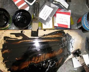
Here's a picture of what this process looks like. I use fancy putty knifes and scoop out the allotted-dose of each color and mix them on a smooth surface. In this case, I'm using small parts of black with brown on my litho. stone. There is a 'pantone book' (much like paint swatches, but much pricier) which I can follow if I am to match a pms color, but many times I go by my eye. This ability is very very useful when matching swatches of fabric, or using transparent ink for a slightly washed effect. Plus I've found that sometimes using just the book would deprive me of some pretty amazing colors.
After I've achieved the perfect color (and if this is to be an ongoing-project), I will save the ink in little packets and mark the client's name and date on them, so I can reuse them the next time we go to press.
On the stone right now, it looks a little messy, but I've just achieved the perfect coffee brown for a small project I'm about to do for Peet's Coffee & Tea.

No comments:
Post a Comment